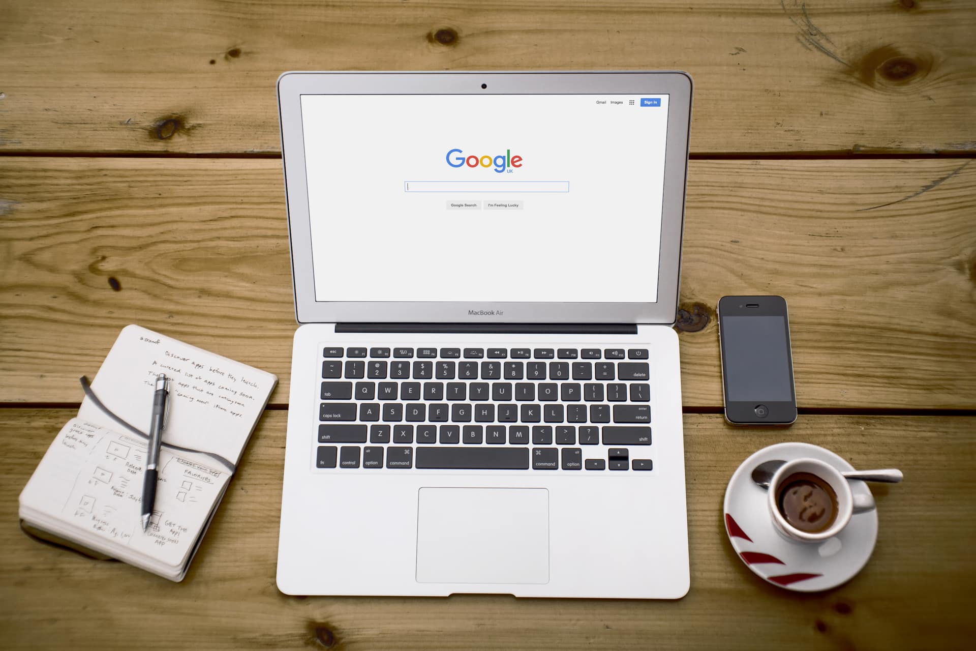
You may have noticed whilst using Google (the World’s most popular search engine), that something has changed… Google have recently altered the typeface used in their logo. The new playful font choice seems to be attempting to convey the cutting edge company that Google are.
The original serif typeface which we have come to associate with Google gave the impression of a more traditional company that believes in sticking to their history and heritage, which is something Google certainly doesn’t do. The new contemporary font style represents Google’s innovative place in the market and will support their new business strategy.
The new typeface is simple, sleek, friendly and less cluttered. This will mean the logo can be easily rescaled and displayed in many different places, platforms and devices without losing any clarity. This important for Google, who constantly strive to be involved in all developments in technology.
The new logo is Google’s biggest update in 16 years and I’m sure Google will be hoping that their new font choice will stand the test of time.
If you’re interested in revamping your logo due to a change of company strategy or simply want to keep up with current trends, please get in touch with us and we will be happy to assist in all areas of your company branding.

